Ticket purchasing experience
When Hamilton came to Broadway, the tickets were so high in demand that it was nearly impossible to get them for almost a year out. By February 2016, the show already had $82 million in advance ticket sales.
Company: SpotCo, (Client: Hamilton)
Year: 2016
Role: UX/Digital designer
The team of two digital designers including myself, one design manager, two project managers and two engineers. Worked closely with a copywriter and a data analyst.
Problem statement
Too many clicks to find availability
Ticketmaster was the only place people could purchase regular-priced Hamilton tickets online. However, people had to click on different months and dates to track down what was available and how much those tickets cost. Because of the show’s high demand, this meant users had to click through over a years’ showtimes.
Risky third party sources
This unpleasant experience drove some people to third-party sources like Craigslist or StubHub. The already expensive standard and premium tickets were going for upward of $2,000 via third-party sources. Along with the high ticket price, many people got scammed with counterfeit tickets.
User story
Meet Jessica — She’s a 35-year-old Creative Director living in LA. She is planning on a trip to New York without a set date. Her main goal is to see musical Hamilton, and she is willing to plan her whole trip around it since she knows the tickets will be way in advance. She and her partner don’t want to take the risk of going through a third-party source. She has been on the Ticketmaster site, but it is difficult and time-consuming to find the right tickets because they have to click on every single date for available tickets at their price point. She’s eager to purchase the tickets, but she finds the processing time consuming and draining.
Explorations
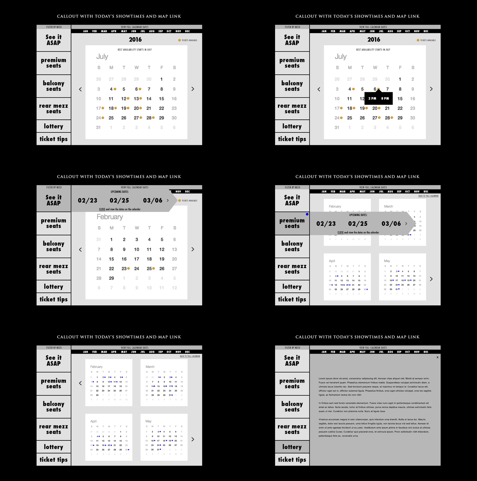
It was clear that the traditional ticket purchasing flow did not work for this show. Show goers cared less about deciding when to see the show but how soon they could. I went through many iterations and different approaches to the calendar design. While it was easier to sketch out my ideas with a pen and paper, it was easier to communicate and conduct user tests by using low fidelity mockups.
Learnings
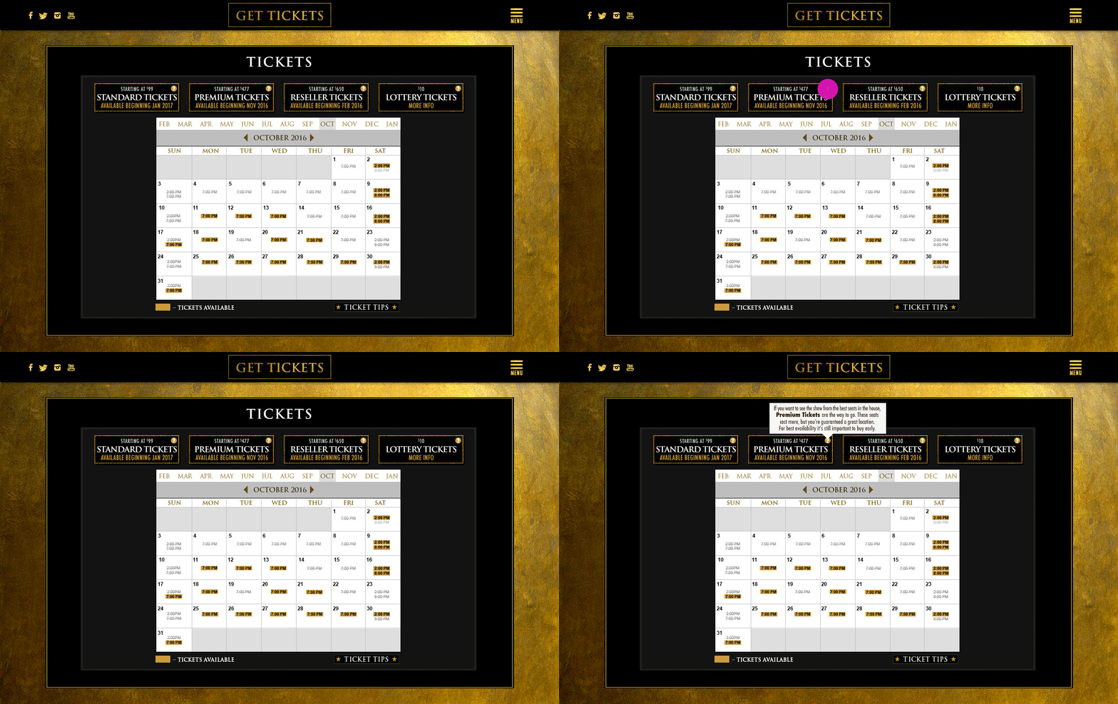
The interactive calendar helped users find available tickets for each ticket tiers more easily. The streamlined navigation ended up decreasing the number of clicks from more than 30 times down to two times, saving time, and improving the overall experience for users.


